

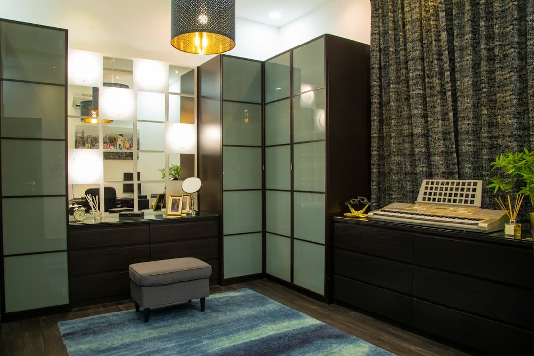
For small or dim closets, start with a light neutral like warm white or soft greige. For spacious, well-lit walk-ins, a rich navy, charcoal, or a two-tone scheme reads as boutique rather than cramped. Whatever you pick, test it under the closet’s own lighting first and finish walls and shelving in satin or semi-gloss so the space stays bright and easy to wipe down.
TL;DR:
Light, reflective colors like warm white or soft greige are ideal for small or dim closets, while larger, well-lit walk-ins can handle darker shades like navy or charcoal.
Darker, moodier colors such as navy, emerald, and sapphire work best in illuminated walk-in closets with layered lighting, but should be avoided in dim reach-ins.
Satin or semi-gloss finishes are recommended for durability and ease of cleaning, with flat paint suitable only for low-traffic, non-contact areas.
Testing full-sized sample patches on the actual closet wall and living with them for 48 hours helps avoid color mismatches caused by lighting and surface differences.
The choice between matching or contrasting closet and room colors depends on whether the closet is visible from the main room or intended as a separate, enclosed space.
Table of Contents
-
How Lighting, Size, and Closet Type Change the Way Color Looks
-
Choosing the Right Paint Finish for a Closet That Gets Used Daily
-
A Simple Checklist for Testing Closet Colors Before You Commit
-
Why Designers Treat Color as Part of the Storage Plan, Not an Afterthought
Closet Color Ideas Worth Trying, From Safe to Bold
Some of these are safe bets you can’t mess up. Others take a little nerve. Here’s where each one earns its place.
-
Neutral whites and off-whites. If your closet is small, windowless, or doubles as a reach-in with barely enough room to turn around, a clean white or warm off-white is still the most reliable choice. It bounces available light around the space and, just as important, it shows your clothing’s true colors instead of tinting everything with a wash of paint. My Custom Closet notes that white remains the top pick specifically because it makes items easier to find at a glance, which matters more in a closet than almost any other room in the house.
-
Soft grays and greiges. A step up from stark white without losing brightness, greige works as a backdrop for nearly any wardrobe, from black work suits to pastel weekend clothes. It’s the safest “designed” choice if you’re not ready to commit to a real color.
-
Deep navy and charcoal. These belong in closets with actual light, meaning walk-ins with overhead fixtures or LED shelving strips. Designers lean on charcoal and navy to create a sense of depth and luxury, and they pair particularly well with brass or unlacquered hardware and warm wood shelving, according to Inspired Closets. Skip these in a dim reach-in unless you’re prepared to add lighting.
-
Forest green and jewel tones. Emerald, hunter green, and deep sapphire bring drama without feeling as heavy as pure black. They photograph beautifully against gold hardware and pair naturally with wood tones, making them a favorite for closets meant to feel like a boutique dressing room rather than plain storage.
-
Warm terracotta, rust, and caramel. These earthy tones feel cozy rather than trendy, and they age well because they’re rooted in natural pigments rather than seasonal fads. They read especially well against oak, walnut, or other warm wood shelving.
-
Pastels: blush, mint, powder blue. Light and airy, pastels suit closets styled with a vintage or feminine sensibility, especially those with glass knobs, brass rods, or a vanity nook.
-
Two-tone or monochrome schemes. Painting the back wall one shade darker than the surrounding walls, or pairing a neutral shelving unit with a bold-colored back panel, adds depth without visual clutter. Domino’s roundup of painted-closet examples shows how specific swatches like Benjamin Moore’s Kittery Point Green or Farrow & Ball’s Lamp Room Gray get used this way, as a single accent rather than an all-over commitment.
-
Accent walls, painted shelving, or painted doors. This is the lowest-risk way to test a bold idea. Paint just the back wall, the interior of open shelving, or the closet doors, and you limit how much surface you’d need to redo if you change your mind in a year.
How Lighting, Size, and Closet Type Change the Way Color Looks
A paint chip in a store looks nothing like that same color on your closet wall at 7 a.m. with the door half open. Closets are small, enclosed, and often lit completely differently than the room next door, which means colors shift more dramatically here than almost anywhere else in the house.
-
Small or reach-in closets do best with light-reflective colors, since there’s less room for light to bounce around in the first place.
-
Walk-ins can handle darker, moodier colors, but only if you add layered lighting, such as recessed cans plus shelf-level LED strips, to keep the space from feeling like a cave.
-
Warm bulbs push colors toward yellow and orange; cool bulbs push them toward blue and gray. If you use the closet morning and night, test your swatch under both.
-
Surface material matters too. Melamine, drywall, and wood all absorb and reflect paint differently, so the same color can look flatter on melamine and richer on drywall.
-
Samplize’s guidance on closet paint recommends painting a full 12 inch by 12 inch swatch directly on the wall and cabinet face, then living with it for 24 to 48 hours before deciding.
Pro Tip: Snap a photo of your swatch each morning and evening for two days. Side-by-side photos reveal undertones your eye alone will miss in the moment.
Choosing the Right Paint Finish for a Closet That Gets Used Daily
The color matters, but the finish decides whether that color still looks good in a year. Closets take a beating from suitcases, shoes, and shoulder bags brushing against the walls, so durability isn’t optional.
-
Satin or semi-gloss is the standard recommendation for closet walls, shelving, and trim, since both finishes clean more easily than flat paint and reflect light back into the space, according to Cozy Vibes’ closet paint guide.
-
Flat or matte finishes can work on low-traffic walls, like the back wall of a walk-in that nothing ever touches, but they show scuffs fast anywhere hands or bags make contact.
-
Higher-gloss finishes bounce even more light and look polished, but they also highlight every dent, drywall seam, or sanding mark, so they demand better wall prep before you paint.
-
Factory-finished closet panels, particularly melamine, need a bonding primer built for slick surfaces. Skip this step and paint will chip or peel within months.
A Simple Checklist for Testing Closet Colors Before You Commit
-
Order three to five samples, not just one favorite. Colors you’d never expect often surprise you once they’re on the actual wall.
-
Paint swatches on both the wall and the front edge of a shelf or cabinet, since factory surfaces and drywall take paint differently.
-
Check the patches at night and during the day. A color that looks perfect at noon can turn muddy under a warm overhead bulb after dark.
-
Hang a few typical outfits and set out your usual shoes or accessories in front of the swatch. You’re checking whether your clothes stand out or disappear into the wall.
-
Decide your commitment level. Painting only the back wall or the inside of the doors keeps your options open if you fall out of love with a bold shade later.
-
If you’re installing custom cabinetry, ask to preview finishes in a 3D rendering or request a real panel sample rather than relying on a screen or paint chip alone.
Pro Tip: Test your top two finalists on opposite walls of the same closet, not side by side on one wall. It’s the only way to see how each color reads with light hitting it from a different angle.
Should Your Closet Match or Contrast the Room Around It?
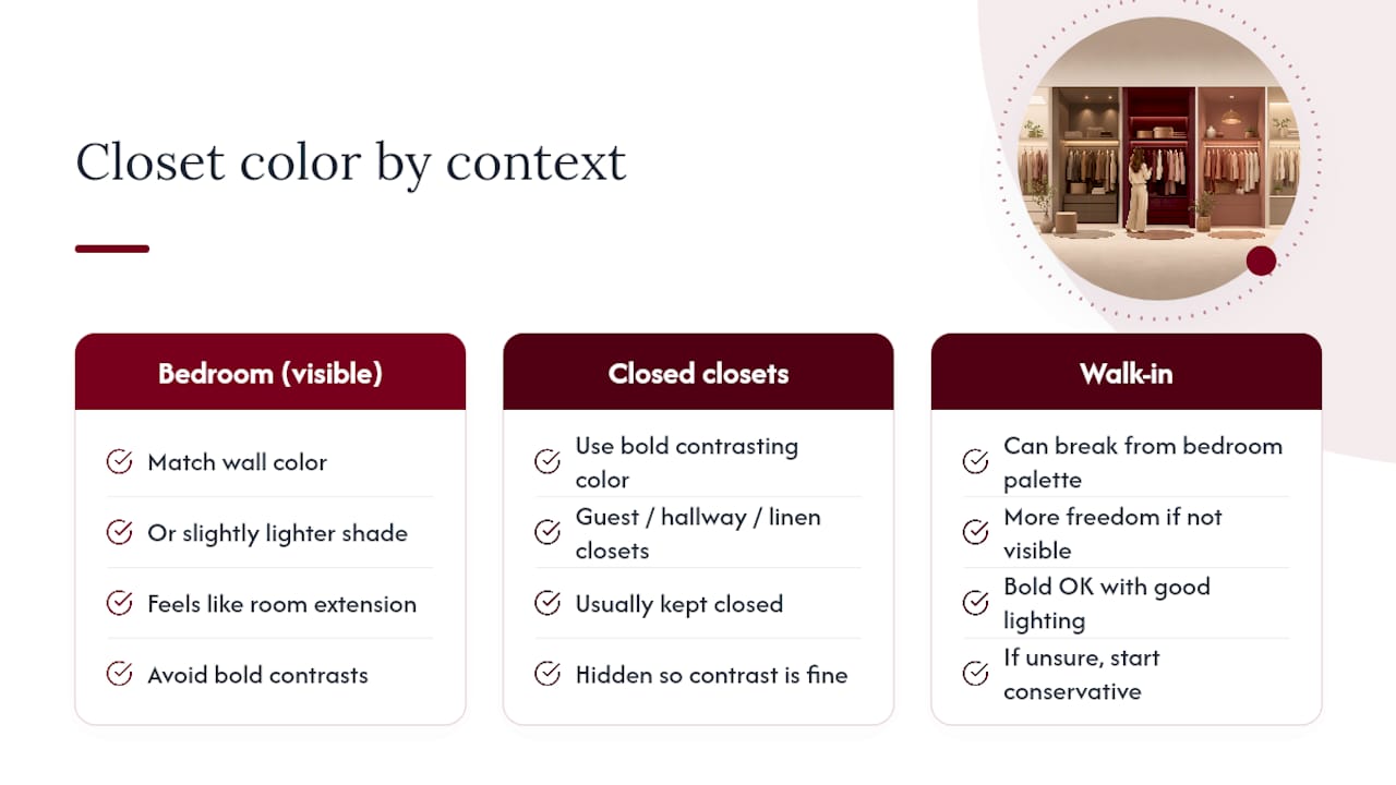
It depends on what kind of closet you’re dealing with. A closet that opens directly into a bedroom, with its door usually standing open, tends to look most cohesive when it matches the room’s wall color or uses a slightly lighter version of the same shade. That way the closet feels like an extension of the room instead of an interruption in the middle of it.
Guest closets, hallway storage, and linen closets are a different story. Because these spaces are meant to be closed and out of sight most of the time, they can handle a bolder, contrasting color without clashing with anything nearby. Consumer Reports frames this as a matching-versus-contrasting decision based on whether the closet is meant to blend in or stand as its own feature.
Walk-in closets sit somewhere in between. Since they’re often treated as a separate room with their own door, they have more freedom to break from the bedroom’s palette entirely, especially if the walk-in has good lighting and isn’t visible from the bed or hallway. If you’re unsure, start conservative: match or lighten the adjacent room’s color for anything visible from another room, and save the bold contrast for spaces that close off completely.
Matching Color to How You Actually Use the Closet
A closet that functions as a dressing room deserves different treatment than one that’s pure storage. If you get dressed in there, spend time picking outfits, or use a mirror inside the space, the color needs to flatter skin tones and clothing rather than just look nice on its own. Soft warm whites, blush, and greige tend to be the most flattering under typical closet lighting, while very cool grays or stark whites can wash out skin tone under warm bulbs.
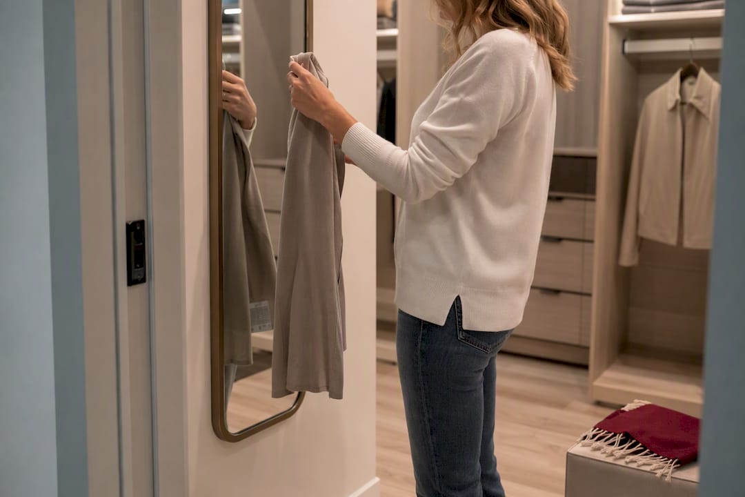
Pure storage closets, like linen closets or off-season clothing storage, carry none of that pressure. These are the spaces where a bold or unexpected color has almost no downside, since you’re not standing in front of a mirror deciding how you look under that paint.
Closets that double as a small office nook or craft space benefit from colors that keep you alert and focused rather than sleepy. Cooler tones and clean whites tend to work better here than warm, cocoon-like shades that suit a bedroom closet.
If your closet holds shoes, bags, or accessories on open display, treat the color as a backdrop for those items rather than a standalone design choice. A muted or neutral tone lets colorful shoes and bags read as the visual focus, while a busy or saturated wall color competes with them for attention.
Why Closet Color Changes How Big or Cozy the Space Feels
Color does more work in a closet than in any other room, simply because there’s so little of it to look at. A small reach-in painted white or pale gray tricks the eye into reading the space as larger and airier than it actually is, since light colors reflect what little natural or artificial light reaches the space. Paint that same closet a deep, saturated color and it can start to feel like a box, especially without supplemental lighting.
Walk-ins flip that logic. With enough square footage and real light fixtures, a dark, saturated color stops feeling confining and starts feeling intentional, closer to a boutique dressing room than a utility space. That’s the psychology behind why designers reach for charcoal or navy in larger closets but almost never in a cramped reach-in.
Mood matters too, and it’s not just marketing language. Cooler colors like soft blues and grays tend to feel calming, which suits a closet you visit first thing in the morning. Warmer tones like terracotta or caramel feel cozier and more grounded, which can make a walk-in feel like a retreat rather than just a place to grab a jacket. Neither is objectively better. It comes down to whether you want the space to wake you up or slow you down.
Timeless Closet Colors Versus What’s Trending Right Now
Warm whites, soft greiges, and deep navy have stayed in steady rotation for years because they work with nearly any wardrobe and don’t date the way a trend-driven color can. If you’re painting a closet you don’t plan to redo for a decade, these are the safest long-term bets.
Right now, jewel tones like emerald and sapphire are having a real moment in closet design, along with warm terracotta and rust shades that lean into natural, earthy palettes rather than cool grays. Two-tone treatments, where the back wall or shelving gets a different color than the surrounding trim, are also showing up more often as homeowners look for a middle ground between an all-white closet and a fully saturated one.
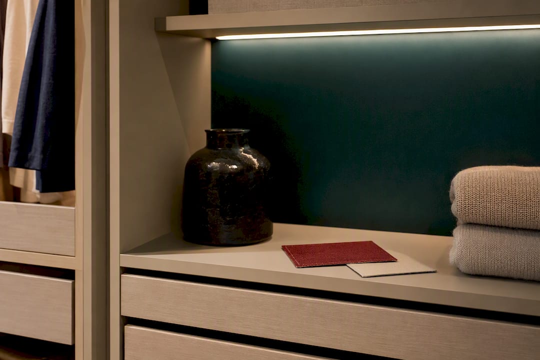
The safest approach if you like a trend but worry about it aging poorly: apply it to the lowest-commitment surface. Paint the back wall, the inside of the shelving, or the closet doors in the trendy color, and keep the bulk of the space in a neutral that will outlast any single season’s favorite shade.
Why Designers Treat Color as Part of the Storage Plan, Not an Afterthought
Color choice works best when it’s decided alongside shelving layout, hardware finish, and lighting placement, not chosen first and built around later. A 3D design preview lets you see how a shade actually reads across drawer fronts, open shelving, and trim before anything gets painted or installed. Many designers lean on neutral cabinetry with a painted back panel or colored door fronts specifically because it’s the lowest-risk way to get a bold look without repainting an entire room later.
— Gary Pavitt
Bring Your Closet Color Ideas to Life With a Free 3D Design
Picking a color is only half the project. The other half is making sure that color actually works with your shelving layout, drawer fronts, and hardware, which is exactly where a lot of DIY paint jobs fall apart. Some custom closet companies build that step into the process from the start with a free in-home 3D design consultation, so you can see how a navy back wall or a warm greige interior will actually look against your real shelving and lighting before anything gets installed.

Many custom closet providers offer itemized quotes, locally manufactured cabinetry, and installation by their own crews, sometimes backed by workmanship warranties. If you’re weighing a bold walk-in redesign, start with the walk-in closet design page to see how color and layout come together in larger spaces, or browse real finished projects in the San Diego closets gallery for ideas before your consultation. Ready to move forward? Request a free design consultation through the custom closet page and get a real quote based on your space, not a generic estimate.
Sources
-
When painting a room, don’t neglect the closet — Consumer Reports
-
Closet Paint Colors: Should You Match or Contrast the Bedroom? — Samplize
FAQ
What is the best color for closets?
Warm white or soft greige works best for small or dim closets because it reflects available light and shows clothing colors accurately, according to My Custom Closet. Larger walk-ins with good lighting can handle bolder choices like navy or charcoal instead.
What color is replacing gray?
Warm, earthy tones like terracotta, rust, and caramel are gaining ground as homeowners move away from the cool gray palettes that dominated the last decade, alongside a renewed interest in jewel tones like emerald and sapphire for statement spaces like walk-in closets.
What color makes a house look expensive?
Deep, saturated shades like charcoal, navy, and forest green tend to read as high-end, especially when paired with brass or unlacquered hardware and warm wood shelving, a combination Inspired Closets points to as a common driver behind boutique-style closet designs.
Should a closet be the same color as the room?
Only when the closet opens directly into the room and stays visible most of the time. Closets that close off completely, like guest or storage closets, can take on a contrasting, bolder color without clashing, based on guidance from Consumer Reports.
What paint finish works best for closets?
Satin or semi-gloss is the standard recommendation because both finishes clean easily and reflect light, which helps in closets that often have limited natural light, per Cozy Vibes.


